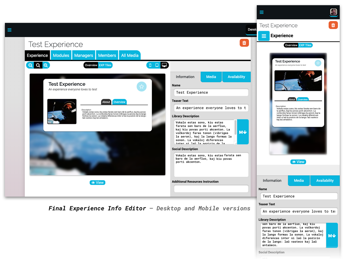

I was tasked by eThree, a digital education startup, with designing and implementing a responsive editor applet for creating Experiences—their app’s core feature for presenting short multimedia lessons in a step-based interface.
The prior builder had been built for desktop only, and was confusing and too design-heavy. We wanted to make building an easier experience, with a design that was both simple and beautiful. And crucially, we needed something which could preview the way an Experience would actually look on multiple device sizes.
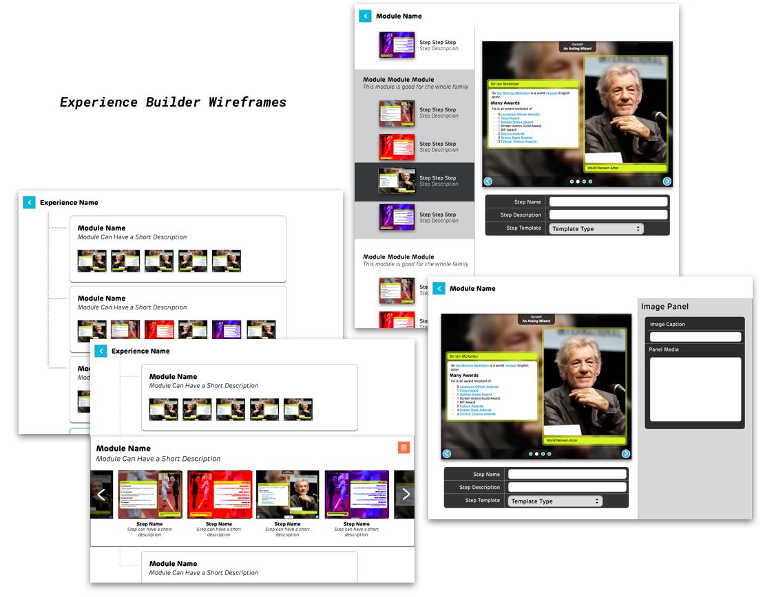
After a few rounds of wireframing and design passes, we settled on a clean, no-nonsense design with a functional yet modern look. Editing model data happened in a suite of components able to interpret model data into UI and display changes to the models in real time. I also made sure these editor components had the flexibility to display on mobile screens with little to no change in their design and functionality.
The Experience Previewer In Action
For the Experience previewer, I leveraged our existing standard of defining sizes in ems to make the viewer resize with a single changing font-size property. We also used a media service which simulated traditional CSS media queries using boolean properties and query-like top-level container classnames; thus, different device sizes were simulated using a stub media object and a few spoof classnames.